Andrew Yu
Hi, I'm a Data Analyst. Explore my projects— if you're tackling a challenge and want to make better decisions, I'm always open to discussing how data can make a difference.
Data Projects & Portfolio
Projects
Showcasing my data analysis projects and case studies.


Hi, I’m Andrew Yu — a data analyst with a strong interest in turning data into practical insights that support business decision-making. I recently completed the Google Data Analytics Certificate, where I developed core skills in data cleaning, analysis, visualization, and working with tools such as SQL, R, Tableau, and spreadsheets.
As part of the program, I completed a capstone project analyzing smart device usage data for Bellabeat, a wellness technology company. The goal was to identify user behavior patterns and provide data-driven recommendations to inform their marketing strategy. You can view the full project here, including my process, findings, and insights.
Going forward, I’ll be expanding my portfolio with new analysis projects and sharing the results on this site. Feel free to explore my work or reach out if you'd like to connect.


Datasets


Customers
Customer-related information intended to support analysis and insights that can improve the overall customer experience and inform business decisions.


Climate
Information related to climate trends, environmental impact, and green energy metrics. It is intended to support analysis on sustainability, energy efficiency, and eco-friendly practices.
What is Data Analysis?
The purpose of data analysis is to discover useful insights and make informed decisions for both businesses and individuals to solve real problems.
Think about a situation in your own life where you are unsure what to do. Instead of relying on your intuition alone, having the right data can help you understand the problem more clearly and choose a smarter path forward. That is the power of data analysis: turning uncertainty into clarity. We do this by collecting, organizing, and examining data using tools like Excel, SQL, R, and Python.
At its core, data analysis empowers us to understand what’s happening, why it’s happening, and what actions will lead to better outcomes.
6 Major Steps of Data Analysis


1. Clarify Your Goal
Start by defining what you’re trying to achieve. Are you exploring a trend, solving a problem, or making a decision? A clear goal helps keep your analysis on topic and focused. If you're analyzing for someone else, ask questions to fully understand their needs. During the phase, using SMART questions can help turn vague ideas into clear, measurable questions.
2. Prepare your Data
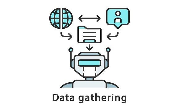
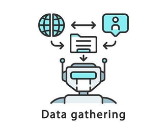
Once your goal is clear, figure out what data you need. This could mean collecting raw datasets, scraping websites, or pulling from databases. Make sure your sources are reliable and relevant to your objective. Think about: what kind of data will actually help you answer your question? Avoid sources that might introduce bias or lead to misleading results.
If you need help on collecting data, here are some suggestions on how to collect reliable and useful data.
3. Process the Data
Most data come in messy. Cleaning it, removing duplicates, correcting errors, and standardizing formats is a big part of data analysis. At this stage, you're making the data usable while remaining reliable which leads to accurate results. At the end of this process, write a simple data cleaning report to keep track of what you changed. It helps others understand your process and makes your work easier to review or repeat later.


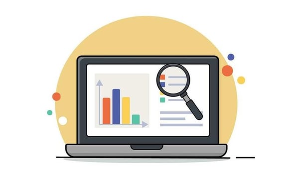
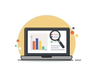
4. Analyze the Data
5. Share Your Findings (Data Visualization)
6. Next Steps & Follow-ups
Now it’s time to dig into the data. Use tools like Excel, Tableau, Python, or R to explore patterns, trends, and relationships. You might use pivot tables, charts, or statistical methods to look for patterns, trends, or relationships that help answer your question.
Make sure to double-check your calculations to make sure everything is accurate before drawing conclusions. The goal is to turn raw data into clear insights
Present your insights in a way that’s quick and easy to understand. A good rule: your audience should grasp your graph within 5 seconds. Use clear, relevant visuals—like charts, dashboards, or reports—and focus on what matters most. Tell an interesting story and explain what it means, don’t just show data.
Think about your audience: What will make the message click for them? Also, keep accessibility in mind (color, labels, readability), and remember to write a short markdown summary and cite your sources.
To make your analysis truly useful, make sure actions are taken. List clear next steps based on your findings—it can be refining a product, adjusting a strategy, or asking new questions.
Always revisit your assumptions and build a feedback loop. Good analysis doesn’t end with answers—it leads to better decisions and continuous improvement.
Below, I break down the 6 key steps I follow in my analysis workflow — from defining the problem to turning data into clear answers and practical next steps.


Andrew Yu
Phone
778-319-3727
andrew@thoughtyose.co.site
Kaggle
Infantry Soldier | The Republic of China Armed Forces
Demonstrated resilience and adaptability in high-pressure environments while maintaining a solutions-oriented mindset
Practiced disciplined execution and attention to detail critical to team safety and operational success.
Additional Skills
Experience
Education & Certifications
Co-Founder | Metric Innovative Solutions
Designed and developed the company website from scratch using Google Sites, applying principles of UX and content optimization to drive 1,000+ unique visitors.
Built Sun Metrics Calculator, an Excel-based solar ROI tool that collects user inputs and automatically logs data into a centralized database, improving lead tracking and client analysis.
Developed automated workflows to streamline internal processes, including client intake, proposal generation, and performance tracking—reducing manual work and increasing consistency.
Created detailed 3D solar proposals and technical diagrams that supported permit applications and solar feasibility analysis across BC, Alberta, and Ontario.
Used structured data and system modeling to support client decision-making, including solar production forecasts, ROI projections, and shading analysis.
Maintained and monitored internal data to improve operations and inform marketing priorities, including early-stage customer behavior from web and form submissions.
Structural Detailing Engineer | Profab Steel Ltd.
Applied strong attention to detail in reviewing drawings, part specifications, and fabrication data, supporting error-free documentation and quality control.
Maintained organized file structures and implemented naming conventions for technical documents, improving team efficiency and version control.
Ensured clear, consistent communication with architects, structural engineers, fabricators, and site supervisors to support project workflows, reduce fabrication and construction issues, and clarify project requirements.
Used and maintained spreadsheet-based material tracking tools (BOMs, inventories), helping ensure accuracy in part lists and fabrication readiness.
Assisted in tracking drawing revisions and change requests to identify patterns in design adjustments and support ongoing quality assurance.
Google Data Analytics Certification
Developed analytics tools; proficient in Spreadsheets, intermediate in R for statistical analysis, and SQL for database querying
Developed analytics tools; proficient in Spreadsheets, intermediate in R for statistical analysis, and SQL for database querying
Microsoft Certified: Azure AI Fundamentals
Demonstrated proficient knowledge of AI concepts, machine learning, and Azure AI services for data-driven decision-making
Computer Information Technology Diploma
Applied skills in database management, web development, and data analysis to create functional and scalable solutions
Developed technical proficiency in SQL, Python, R, HTML, CSS, JavaScript, and React through hands-on projects and coursework.
Additional Technical Skills: Business Analytics, Project Management, DeepSeek, CAD, Tableau
Languages: English, Mandarin

Get in Touch
Let me know what you're curious about. Questions, comments, or critiques are always welcome. If you'd like to connect or chat more, feel free to reach out.